Tuesday, May 30, 2006

Ballpoint Pen

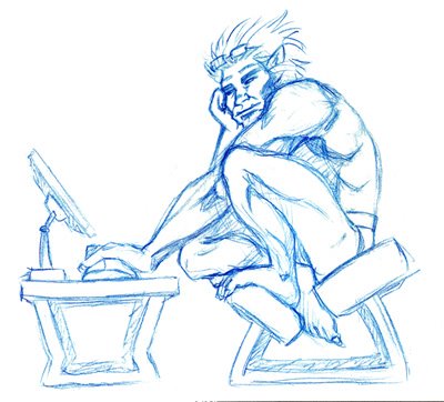
The nice thing about ballpoint pens (apart from the part where people leave them in my office occasionally) is that you can get halftones with them. Here's a couple sketches from early April.

A random web guy:


and something creepy inspired by the title "Don't run with scissors."
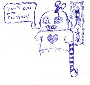


He's a bit disembodied because I stuck him into a corner of the sketchbook already partly occupied by the web-guy above.

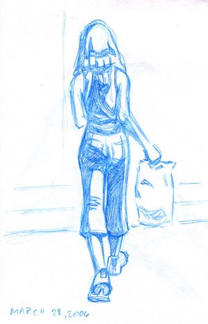
Plus, something I did today, inspired by the "Girls in the Rain" thread on the Drawing Board forums. My girl turned into a ghost in the rain:


There's a bit of a difference in colour between the ghost and the passersby, due to me drawing the ghost freehand but sketching the pedestrians in lightly with pencil. The pencil didn't quite erase, and so they look darker -- which actually suits the drawing well. This ballpoint pen was unfortunately one of the blobbier pens I've used, and some of the dark blotches were completely unintentional. I also meant to put some houses in the background, but this was the last thing I did before going home and I never got a chance to.

Actually, after taking a good look at it, that ghost reminds me of the spider chick in Wapsi Square. Funny coincidence!
Sunday, May 28, 2006

Markers

A few years ago, I started putting together a collection of Pantone Tria Markers (actually, I received the first 10 or 12 from my husband for my birthday). I haven't had much practice with them, though. They are so expensive that I don't have all the colours that I might like to use and I feel bad about using the colours that I do have.

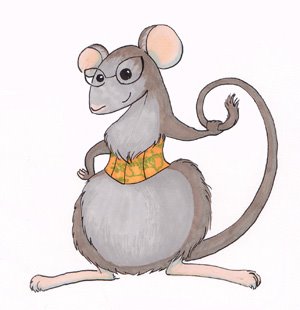
But I've managed to put in a little bit of experimentation and at least see what I need to be working on. So here is a bit of coloured line art. A mousecot comissioned by a friend (her final version was vector art, done in Illustrator but I coloured the line art after I was done):


and a little head-shot of my undead World of Warcraft character.


I think what I need to work on most with the colour is greater contrast. These two drawings are pretty flat and don't have a whole lot of shading. And I think that I will need a bigger range of markers to be able to get a bigger shade range.

In the meantime, I have a couple more pencil pieces that I am inking, and I will probably scan the lineart and try both digital colour and marker colour to see what I can do with them.

Thursday, May 25, 2006

Beast

I've been into comics since elementary school, although these days I only bother to buy graphic novels since they stand up to abuse better. I used to go to the local library when I was a kid, hang out in the Young Adult section and read the comics they had there. I read Batman, New Titans, Cloak and Dagger, Justice League, Hawk and Dove... everything that the library had I went through at least a dozen times. But I saved up my almost-nonexistent allowance to buy Excalibur issues (because Alan Davis rocked. No, really. He still does.) and some of my love for Excalibur rubbed off on the X-men.

So, this is a sketch of Beast, whom I always rather liked. It's a bit messy because I had a hard time figuring out the anatomy. I think I muffed some bits up because my normal anatomy reference has buggered off to Banff for a few days and I had to refer to random bodybuilding photos. Which, I may say, seem designed to hide all the muscles I need to look at.


I think this sketch could do with a bunch of cleanup and some inks. I'll have to enlarge it first, because I've been drawing all this stuff in my tiny travel sketchbook.

Wednesday, May 24, 2006

While I'm Here...

Here's a pirate ninja monkey from my 2004 sketchbook. He was my first attempt at inking a sketch in Adobe Illustrator (the colours were later done in Photoshop).


I was disappointed with the end result, and eventually I discovered that I like the old-fashioned nib pens much better than digital inking so I've stuck with that.

Tuesday, May 23, 2006

Meetings

Are so much more productive when I can doodle.


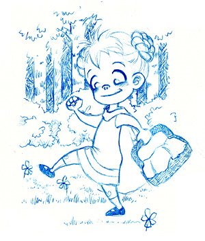
Well, more productive for me, anyway. I was going to do some more fan art, but then I thought about illustration, its respectable twin. It's interesting, but I think the only difference between them is copyright. Anyway, here's Little Red Riding Hood. I've had her on my mind lately. The meeting ended too soon for me to finish the picture of the Wolf.

Sunday, May 21, 2006

A New Sig

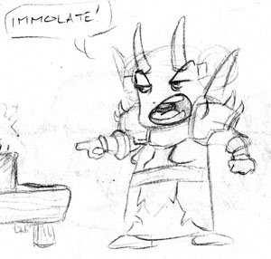
In March, I sketched this drawing of my little Horde Warlock from World of Warcraft and I've been using her as a sig on my guild's forums.


Last weekend, though, I deleted her and made a hunting cow instead, rendering my sig obsolete. I need a new sig. I have a terrific design for one (a surfing Tauren. The title is... wait for it... "Cowabunga". Feel free to smack me now.) But it'll take a while to ink and colour.

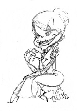
So I started playing around with different renditions of my main character, seeing if I could whip up a freaky sketch to use in the meantime. Here is a very cartoon-villainesque rendition:


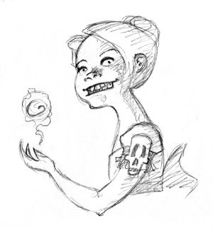
And here is the twisted child warlock I will probably end up using:

Saturday, May 20, 2006

Sketchies

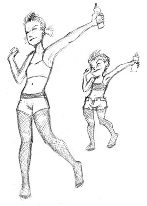
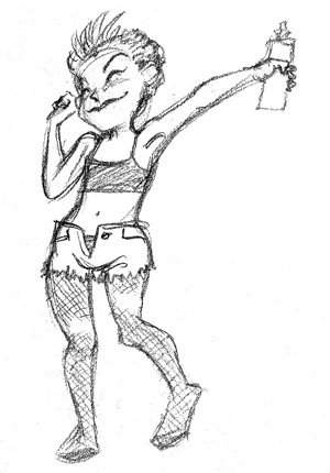
A dancing girl. It's difficult to portray the movement involved in dancing, probably because the whole body moves, but in a limited way. I was experimenting with indicating motion through hair -- although her hair indicates entirely too much motion!


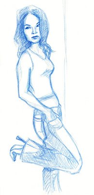
And here is Lucy Liu, from a reference photo. She was April's Drawing Jam girl on the Drawing Board forums. This is my second attempt at this pose. I meant to just draw a generic character using the photo as reference, but in the end it looked so much better than my first, more accurate try that I changed the face to be more like Lucy's.

Friday, May 19, 2006

The Art of Caricature

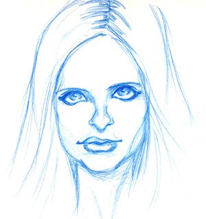
I'm still plugging away at it. I swear, I did SO many searches for Sarah Michelle Gellar that Google thinks I am a stalker now. I got one semi-decent drawing out of it that, on second look, actually looks more like Sarah Jessica Parker. Victory it isn't.

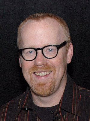
The nice people on the forum where I posted my image for C&C suggested that I ought to start by trying to draw someone who is more lumpy. I decided to take their advice before disturbing Buffy dreams started coming my way. So without further ado, here is my first attempt at Adam Savage from Mythbusters.

So we've got a reference photo:


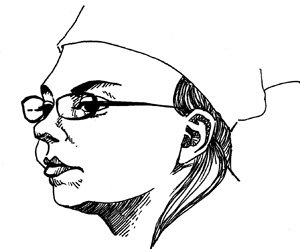
aaand a scary portrait:


aaand a not-so-scary caricature:


I think it sorta maybe looks like him. Go me! I clearly ought to put in more work on portraits, though.

The interesting thing is that I had to squash the drawings a bit because the angle at which I end up holding my sketchboard means that the drawings all end up oddly elongated. I should really clean all the crap off my drafting table so that I can set the drawing surface at an angle and eliminate my problem.

Tuesday, May 16, 2006

Welcome to Lagomorphosis, sketchblog and art blargh. I mean, blog. I needed a separate space to put my art and minutiae of art production. Mostly so that I can keep my hobby separate from my ranting on about personal matters. Not that this won't eventually degenerate into personal matters, but at least they will all be about art.

Today's Work

I might as well post what I've been working on today. I will eventually fill in posts from my previous blargh but in the meantime we'll stick with what's going on now.

I've been trying to develop my digital painting skills, partly because I love some of the effects people achieve with them and partly because it's good for my colourwork. I need a better sense of how to put colours together to achieve certain effects. What I think I really need to do is buy a laptop and head out to places outside my basement and practice painting from life, but in the meantime I'm practicing on various photos I've taken.

So today I was blocking in colour on a picture of a waterfall. I took the photo in Jasper, Alberta several years ago and while the rock textures are fairly complex, the shapes themselves are simple enough. Because I have a tablet, I used pressure-based line width and opacity, which is something I don't do all that often.

Anyway. Here's my waterfall:


and here's the reference photo:


I'm not sure how much more texture to add, though. By going over the photo in detail and zooming in on the painting, I could make it very detailed indeed. I started doing that with a photo of a pansy. But that is very, very slow work and when one is working from a photo, well, one begins to wonder what the point is. So I can make a photorealistic picture of... something I already have a photo of. Great.

Still, the rough looks quite good in a blocky sort of way. With a little bit of refinement it could make a very nice print. I guess that is what I will be working on next.

Sunday, May 14, 2006

Still Working

The last thing I did on Thursday:


Practicing caricatures on Sarah Michelle Gellar. Afterwards I tried to distort this one further, but distorted too much and lost the likeness, creating another monster in the process. This is the slightly-older Gellar, she doesn't have the characteristic round cheeks she had early on in Buffy. I never really noticed before that the tip of her nose is a rhombus of sorts. Weird, huh?

Wednesday, May 10, 2006

Art

I've been screwing around a bit more with caricatures, and I did up a couple of self-portraits using Vee's photos as references. First, the really terrifically ugly one:


Reminds me of some of the creepy psychic kids from Akira. Then there is the great-by-comparison picture:


You can tell all my genes come from Slavic peasants. But I'm pretty sure I don't look quite this much like a pig in real life! I guess caricatures are one way to keep oneself humble. Or drive oneself crazy, either or.
Wednesday, May 03, 2006

Caricatures

I've started experimenting with caricatures lately, even though I'd never been very interested in them before. I think I'm curious about them partly because I've stumbled across some caricaturists' blogs, and partly because I think that this exercise will make me a better artist. You have to be able to really see features before you can exaggerate them well, and anything that helps me see better can only help me.

In the process of all this experimentation, I have discovered that I have a heretofore unnoticed but interesting talent: I have the ability to take a perfectly normal picture of an actress or supermodel, and make her look like Michael Jackson.

Allow me to demonstrate with the lovely Kristin Kreuk:


First, I tried to do a decent sketch. It turned out all right -- there are a number of flaws, but it is still recognizeable as a depiction of a female human being.


Then I did a quick pen sketch to see if I could push the features a bit and emphasize her eyes and lips:


As you can see, the transformation has begun. I fixed her up a bit once I noticed what was happening, but here is a sketch with the necessary bits added in: prominent cheekbones, a slightly more square chin and the top lip reduced.


The resemblance is uncanny.


I have also done this successfully with Lucy Liu -- heck, I make it sound intentional when it just happens as a matter of course -- but I'll spare you that sight.

Unfortunately, no one really wants to pay cash moneys to make pretty women look like creepy male plastic surgery victims. Now if I could do the reverse and make Michael Jackson look like a supermodel... well, I still wouldn't make any money, because anything to do with Jacko is just way too weird.

Wednesday, April 26, 2006

Kniggit

I was going to post a sketch of Moof -- I mean, Link -- from Wind Waker, but I'm having a hard time cleaning him up and making him presentable. I'll have to maybe trace him on the light box and ink him before I loose him on the world.

In the meantime, here's a Kniggit:


While I drew him, I wondered about what sort of tabards people would wear in modern times, and very quickly realized that we call them "t-shirts". This is why his tabard says "Porn Star".

Sunday, April 23, 2006

Digital Painting

I'm trying to get more time in practising my digital painting -- specifically, using photos as reference. This is only my second try, and I've put up the rough version. Most of the colours I eyeballed but I am not very good at it yet so I confess that I have cheated a bit with the eyedropper tool.

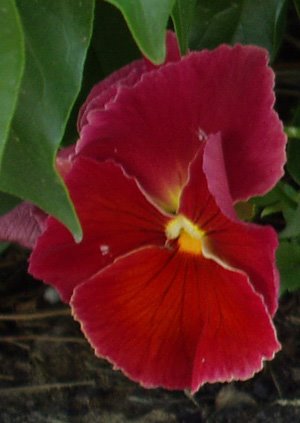
Here's the rough pansy:


And here's the reference photo:


You can see that there's a few problems with my version, mostly in regards to shape. Mine is wider (Neil says: "fat 'n' sassy!") but it's still recognizeably a red pansy, so it's not too bad.

Friday, April 21, 2006

Today's Special

Troll shammy:


Plus a confused bedroom monster:

Wednesday, April 19, 2006

Later...

Okay, here's the Drood, looking more leer-y than ever. I love this guy:


You know what else I love? Rammstein. Rammstein is terrific music to do art to, AND it's just about the only music that we can listen to on a car trip, since you can actually hear it over the whooshing of the wind going past our tiny car. I've been alternating listening to Rammstein and O-Zone's Dragostea Din Tei all week now, and I feel so happy and angry at the same time! Yay!

Saturday, April 15, 2006

Stabby Goodness

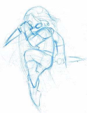
A sketch of my gnome rogue. Trying to do a nice, semi-dynamic body composition. Probably another sketch that will look fantastic in colour.

Wednesday, April 12, 2006

Night Elves

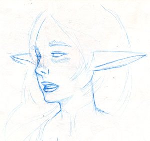
A sketch from a photo reference (nothing special):


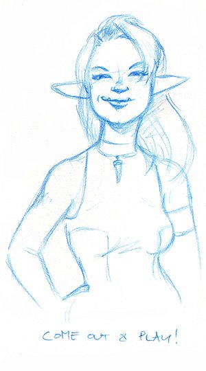
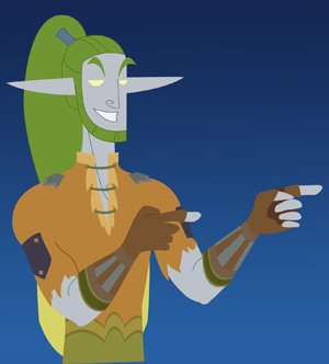
And what I've done so far on my would-be-playa druid:


Hmm. I guess I need a bit more skin-tone contrast. Some shadows would probably help, too.

Tuesday, April 11, 2006

Daily Artwork

So here's a preview of what I've been working on for Neil's birthday. I took a sketch like this:


and toiled away on vector art in Illustrator for a week or so until it now looks like this:


That's an almost-fully-rendered set of Felheart there, being modelled by Neil's tiny warlock. My only qualm is that I used a wall from the inn in Tanaris for reference, and even with colour adjustment it doesn't provide quite enough contrast with the Felheart armour to really pop. I should have used one of the night elf inns. I may have to remedy that this weekend.

In any case, I used our photo printer to put the image onto a 5.5" x 8.5" card, and I also made a sig he can use on the guild forums and will probably make a wallpaper version too. I'd also like to submit it to the Blizzard fanart repository, but I'll ask Neil first, since it's half-his.

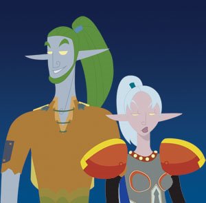
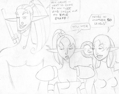
Phew. Now I'm working on colouring a dumb little comic from my sketchbook, starring my small night elf army:


In case it's hard to read, that's my Level 12 Druid going on about his "epic staff". I'm sure it's been done before. I'm just experimenting with a more stylized drawing style.

Friday, April 07, 2006

Today's Sketchbook

A demonstration of my retarded inking skills through random photo reference. The first face is just me trying to draw the actual individual features in the photo without any sort of attempt to put them together in a holistic sense.
The second face is using the features in the first drawing to make an actual character.

Thursday, April 06, 2006

Supervillain

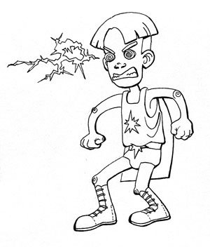
Here's a little guy that's headed nowhere good:


It's a rework of a sketch I did in a meeting earlier this year, with cleaner inking and the kid reworked to look a little more unique. The inking is clean enough that I'll probably colour him.

I guess this sort of work brings me to one of the major woes in my life, and that is the fact that my inking sucks. I am a TERRIBLE inker. I've recently been able to get some decent results with a nib pen while doing my comics, a few less-than terrible results with a brush and some mediocre-but-clean results with vector graphics. Every other attempt? Sucks. It may be that I am used to working on too small a scale, because I can certainly get my colouring to look decent in Photoshop. Maybe it's time to clear off the ol' drawing table and invest in some larger paper.

Actually, thinking about larger paper makes me miss that one studio course I took at the U. I'm checking out more sketchblogs lately and I keep thinking that I would still like to go to Illustration school. The key to good art is practice. The key to practice (at least for me) is to have a professional poker (as in, "You! Artist! Get going! [poke poke]) and there's nothing quite as sharp and pokey as a deadline. I am not a self-motivated person. Sigh.

Wednesday, April 05, 2006

Dessins du Jour

Some more experiments in realism/not-so-realism. Pose from a photo and the subsequent messing around.


A closer look at the more cartoony version:


A girl from a photo on someone's blog:


And because I can't stop reading Go Fug Yourself (even though I'm philosophically opposed to fashion commentary... But then the authors go and post another picture of Bai Ling and I think "OMG Bai Ling, I have no clue as to who you are but if I just keep watching you I will have awful drawing material for decades.") I pushed the poor girl into GFY mode:

Tuesday, April 04, 2006

Cartooning

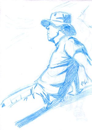
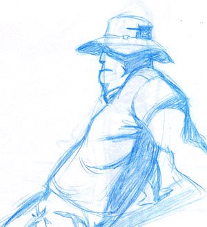
Here's a sketch I did last week of some random guy on Flickr. The photo was taken in full sunlight and the shadows were nice and crisp. I went with the stark, easy-to-ink look rather than halftones.


And then I tried to do a more simple, cartoony version -- not a direct conversion, but pushing the features and body in one direction:


An altogether beefier kind of guy, the sort of guy you imagine as a security guard or policeman of some sort. I cut the legs out of the picture because I screwed up the angle on them.

Monday, April 03, 2006

Still Sketching

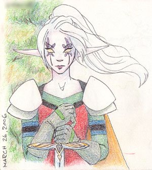
This is Miss Cy, my night elf warrior and potion dispenser. She majors in big-ass axes but I'd have to draw her in a completely different pose for that.


I didn't finish the blurry tree background, but I figured I'd better scan this in before the pencil crayons rubbed off too much.

I'm still working on adding a few drawings to the sketchbook every day, but the scanning is going a bit more slowly.

Saturday, April 01, 2006

Keepin' it Original

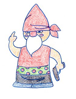
Ladies and gentlemen, the first gangsta gnome:


A little rounder and cuter than the Gimp version.